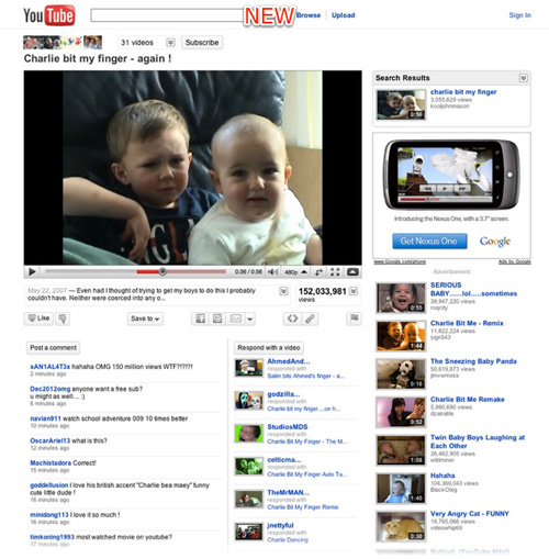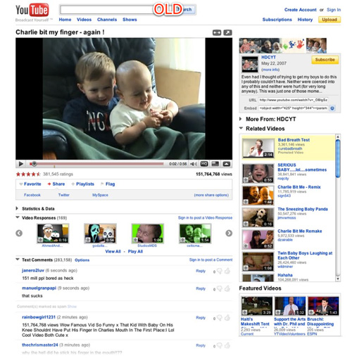
After a long phase of testing and planning, YouTube comes up with a new look. This has generated mixed reviews about the #1 video-sharing website. The millions of users around the world will be welcomed on the site with several changes in the video playback page. Many elements have been relocated where others have changed and many new tools added. The major change YouTube made is the elimination of that irritating clutter.
We heard from users that there are a lot of unnecessary features and clutter that could be cleaned up.
YouTube spokesperson Chris Dale told TechNewsWorld.
“Video is the center of our universe, and it’s the center of the user’s universe, and that is much clearer in this redesign than it has been in the past,” he maintained. “We’re bringing everything back to centering on the video experience and how the users are engaging in that video.”
The other part of the problem was that YouTube had two distinct groups of users. Those who wanted a simple, video-centric experience, versus those who wanted the “airplane cockpit” of links, buttons, and knobs. The new look is an attempt to satisfy both groups, while tweaking the overall look to make the pages less overwhelming to newbies.

At first glance, the changes are subtle, but long-time YouTube users will spot the changes right off. Due to the changes, the clips section is now more “clean” and agile, and easier to use when tried to play. One of the main changes is that now it is more direct access to the other videos of a user. From today, the channel that owns the video and the button to subscribe to it are above the box that shows the clip. Additional information about the clip you’re watching has been consolidated in one place. It can be found underneath the video window. To see more details about the video, you click an arrow to the right of the description snippet, or in the “views” box. The action bar has been cleaned up and the presentation of controls for sharing, flagging and embedding videos streamlined. The volume button has once again been relocated, but the side slide bar is not that striking. At least it does not pop up over the video.

Along with the viewing experience, YouTube has also made it easier to track the popularity of a video. The view counter can now be expanded to show insight analytics, along with a timeline of how the popularity has evolved. It’s no longer the system of five stars, now the users can only qualify the content with a “like” or “do not like.” This change was prompted from the fact that about 90 percent of users click either on five-star ratings, or on one-star ratings; and almost no one clicking on the intermediary two or three star ratings.
If a video owner has created other videos, these now show up on the top of the page without cluttering up the sides with a myriad of thumbnails and links. YouTube is also giving content owners a way to add branding. Users will be encouraged to go to a “next” or upcoming video with new elements, with larger “hit” areas to make it easier to navigate. The intent is to get users to watch “sessions” of videos rather than just one video.
Now, when you subscribe to a channel (or edit your subscription to an existing channel), you can elect to receive an email the instant the person you’re subscribed to uploads a new video. This will appeal to people who check their email more frequently than they log in to YouTube (although these people are still a myth) but who also want to know immediately when their favourite content creators upload new work.
There are five new languages in which YouTube can be experienced: Greek, Hungarian, Finnish, Danish and Norwegian. Simply scroll to the bottom of any page, find where it says “Language” and click on your current language to access the full menu of options, including the five most recent additions.
image source: TechChrunch
You Might Also Like:
Like this post? Post Comment and Subscribe RSS

Pingback: Tweets that mention YouTube Gets a New Look #youtube (via -- Topsy.com()